Website Design
Riverbank Capital
The Vision:
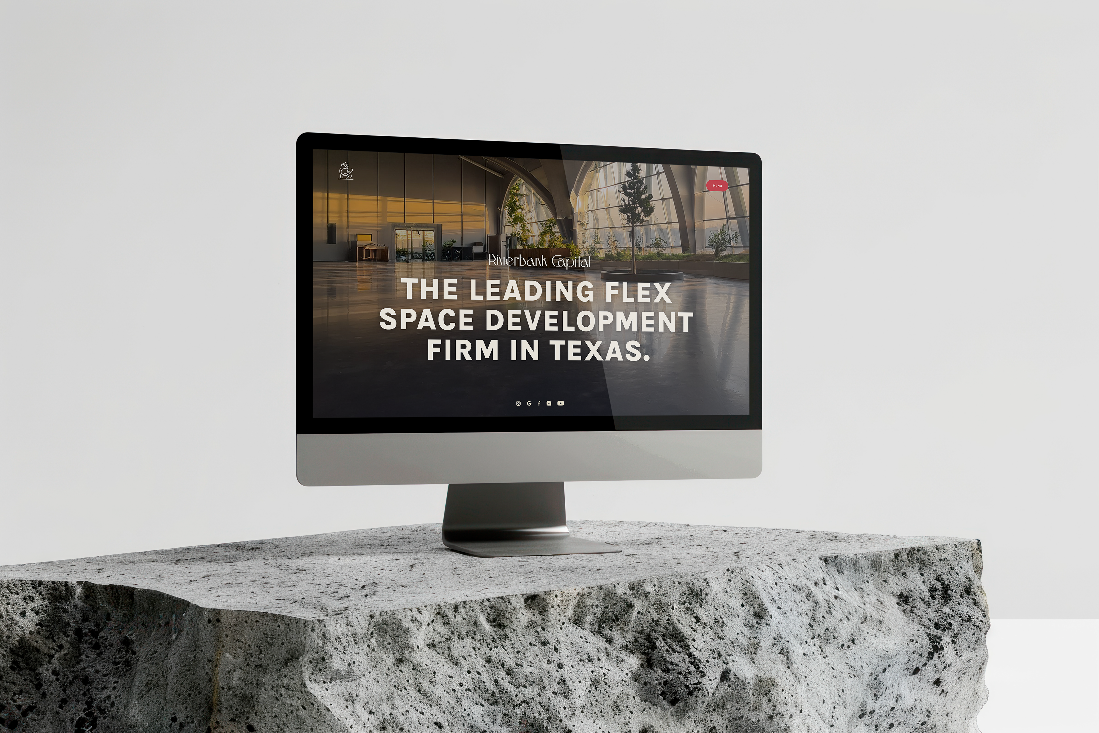
We coined it "Texas Modern." The goal was to create a visual language that felt intrinsically Texan – confident, bold, maybe a little maverick – but executed with the polish and gravitas expected of a top-tier capital firm. It needed to look sharp, intelligent, and forward-focused.
Design Strategy & Execution:
Visual Identity - Sophisticated Regionalism: Establishing the Texas focus was key, but it had to be done with finesse. The stylized longhorn/bull graphic became a cornerstone – instantly recognizable as Texan, but rendered cleanly, abstractly, avoiding any dusty clichés. We paired this with a palette dominated by deep charcoals, crisp whites, and a robust, unapologetic red. That red isn't just color; it's confidence, the energy of the Texas market, and leadership.
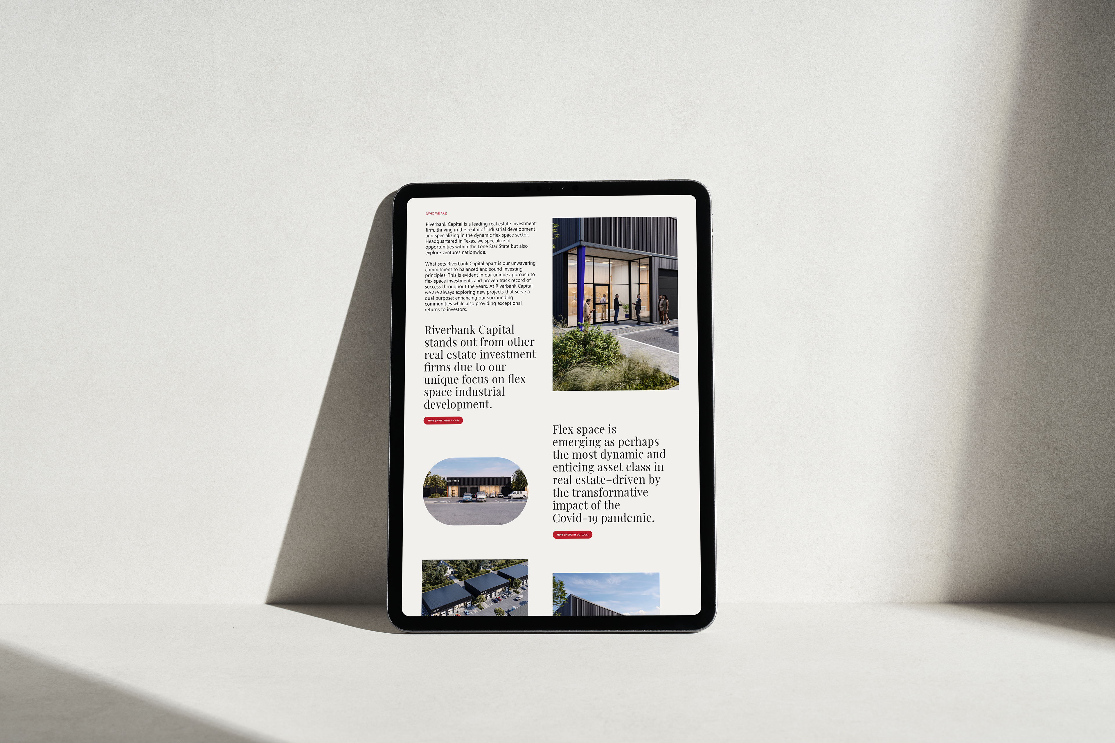
Imagery as Evidence: The proof is in the portfolio for a development firm. We prioritized high-caliber architectural photography that showcases the clean lines, modern aesthetic, and functional appeal of their flex space projects. These aren't just buildings; they're assets, and they need to present themselves accordingly. The cityscape image used later reinforces the connection to the vibrant Texas economy.
Typography - Authority & Clarity: The typography choices are deliberate. Bold, commanding sans-serif headlines immediately establish authority – "THE LEADING FLEX SPACE DEVELOPMENT FIRM IN TEXAS." There is no ambiguity there. Supporting text is set in a clean, highly legible sans-serif, ensuring that information about investment value and property features is communicated clearly and professionally. Using numbered lists for key benefits (such as scalability and customization) makes complex advantages easily scannable.
Layout & Structure - Confident Flow: The layout employs strong contrasts and generous spacing to convey a high-end aesthetic. Bold color blocks, such as the red section, punctuate the flow and draw attention to key messages. We structured the narrative logically: establish leadership (hero), define the value proposition (intro text and benefits of flex space), provide proof (property visuals and key advantages list), and drive action ("Partner With Us"). It’s designed to guide a sophisticated audience through a compelling investment narrative.
Branding Cohesion: The consistent use of the specific red hue and the longhorn motif throughout the design reinforces the brand identity, making it memorable and distinct.
Outcome:
The Riverbank Capital website projects precisely the image required: a confident, sophisticated leader laser-focused on the Texas flex space market. The "Texas Modern" aesthetic successfully blends regional identity with high-finance polish. It’s a platform designed to inform and impress high-value investors and tenants that Riverbank Capital is the premier partner for capitalizing on this dynamic real estate sector. It looks like leadership.