Web Design & Branding Guideline Design (2023-2024)
COMPANY: Riverbank Lending
The Vision:
The core idea quickly became "Modern Frontier." We wanted to evoke a sense of American heritage, reliability, and perhaps a touch of rugged independence but execute it with contemporary design sensibilities. It’s a balancing act—project stability and trustworthiness without appearing dated and conveys ease of use without feeling flimsy.
Design Strategy & Execution:
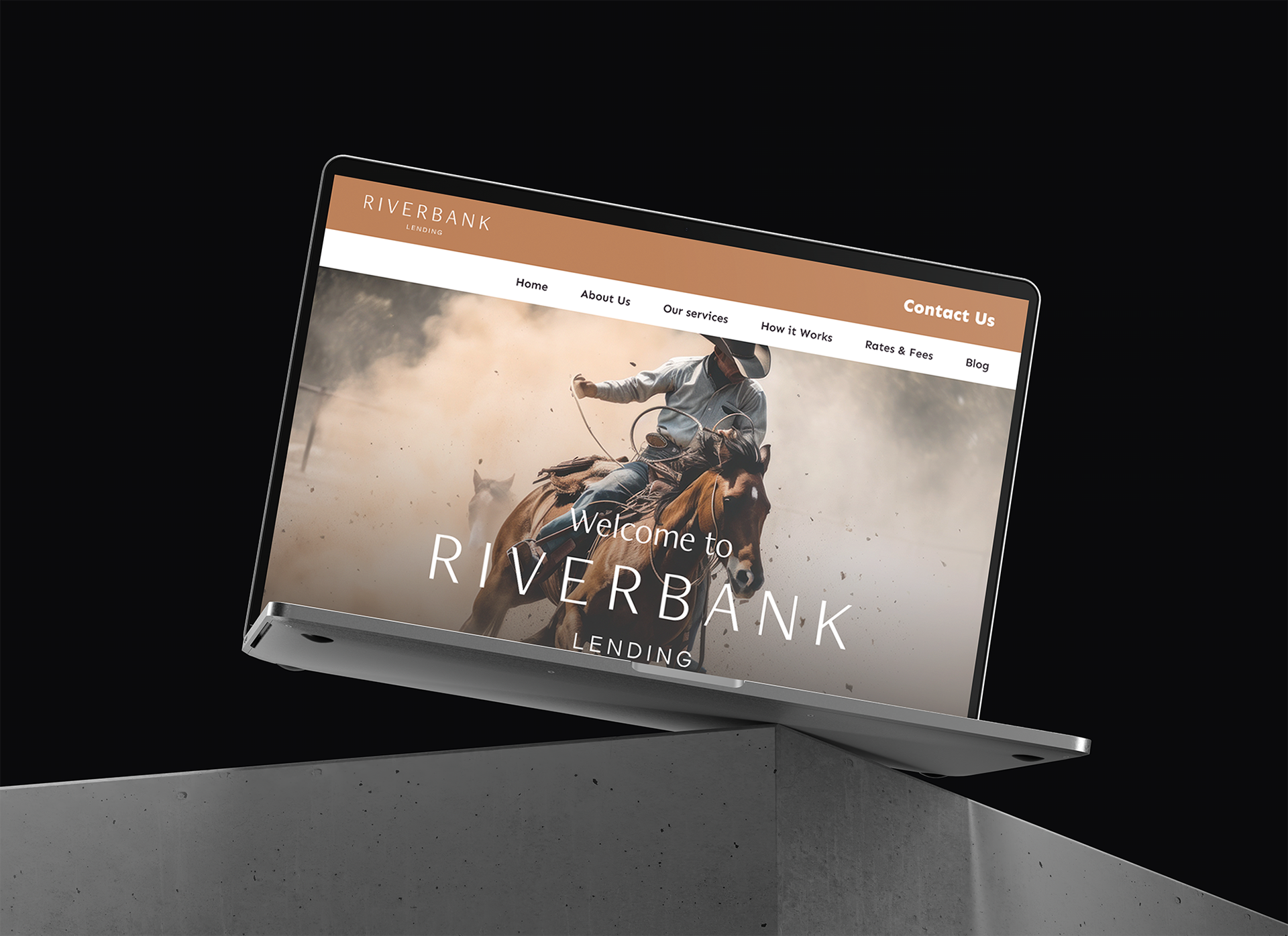
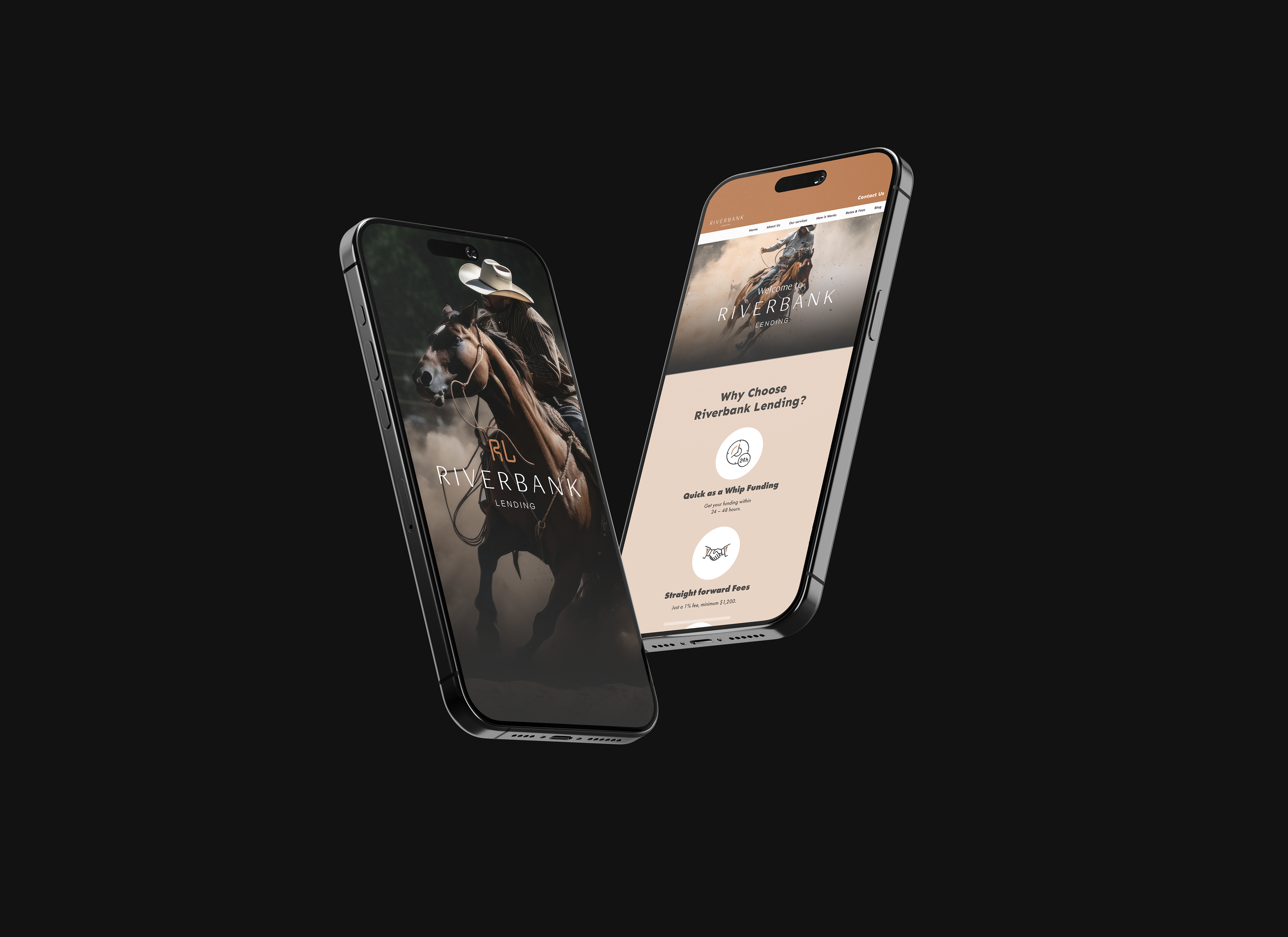
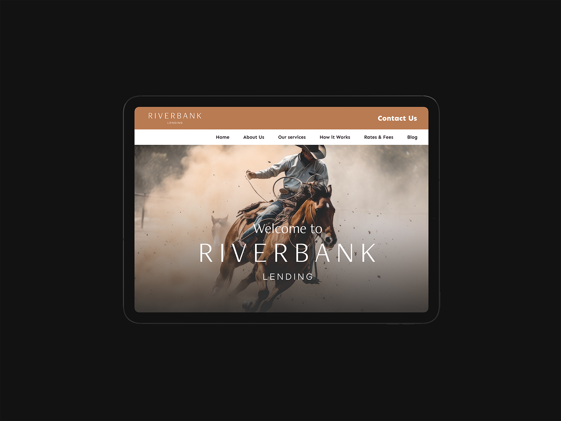
Visual Identity - Rooted Modernity: The key was the juxtaposition. Powerful, evocative imagery associated with the West – the lone rider, the expansive landscapes – immediately sets a distinct tone. It suggests resilience, dependability, and a connection to something tangible. We paired this with a clean, structured layout, modern typography, and a refined, earthy color palette. The browns, tans, and deep grays feel grounded and serious, while ample white space keeps it clean and breathable. It’s about looking established, not old.
Imagery as Metaphor: That hero shot isn't just decoration; it’s a statement. It speaks to navigating challenges, independence, and a journey – metaphors that align well with securing funding for real estate. It immediately sets Riverbank apart from the typical corporate stock photos often seen in finance. The landscape imagery reinforces this grounded, expansive feeling.
Typography & Hierarchy - Clarity First: In finance, clarity is non-negotiable. We selected strong, clear sans-serif fonts. A slightly bolder headline weight ensures impact, while the body copy is optimized for readability. The information hierarchy is crucial: users need to quickly understand what Riverbank offers ("Real Estate Funding"), why they should choose them (the icon-driven benefits), and how to proceed (the three-step process).
Layout & User Flow—Building Confidence: The structure is deliberate. We guide the user from the initial brand statement (hero section) through clear value propositions ("Why Choose Us"), building credibility ("About," "Testimonials"), demystifying the process ("Three Simple Steps"), and leading to a clear call to action. Using distinct background colors helps segment information, making the page easy to scan and digest. Icons provide quick visual cues for key benefits.
Tone - Straightforward & Reassuring: The visual language is complemented by direct, benefit-oriented copy ("Quick & Simple," "Straightforward," "Smooth Ride"). It avoids jargon and focuses on making the process seem manageable and user-friendly.
Outcome:
The Riverbank Lending website successfully carves a unique visual identity in the financial space. It leverages the "Modern Frontier" concept to project an image of reliability, trustworthiness, and straightforward dealing, all wrapped in a clean, professional, and user-friendly design. It feels approachable yet substantial, designed to convert visitors by building confidence and simplifying the perceived complexity of securing real estate funding. It has character, and in a sea of sameness, character counts.