Graphic Design (2019-2020)
COMPANY: Seneca Women
Overview
The core challenge here was to visually translate Seneca Women's powerful mission—highlighting, celebrating, and amplifying women's voices—into a compelling and consistent digital presence. This wasn't just about creating visually appealing images, but about designing a visual language that felt authoritative yet approachable, inspiring, and distinctly aligned with their brand's purpose. We needed to craft assets that would cut through the noise of social feeds and command attention, particularly for initiatives like "101 Women to Hear" and "Made By Women."
The core challenge here was to visually translate Seneca Women's powerful mission—highlighting, celebrating, and amplifying women's voices—into a compelling and consistent digital presence. This wasn't just about creating visually appealing images, but about designing a visual language that felt authoritative yet approachable, inspiring, and distinctly aligned with their brand's purpose. We needed to craft assets that would cut through the noise of social feeds and command attention, particularly for initiatives like "101 Women to Hear" and "Made By Women."
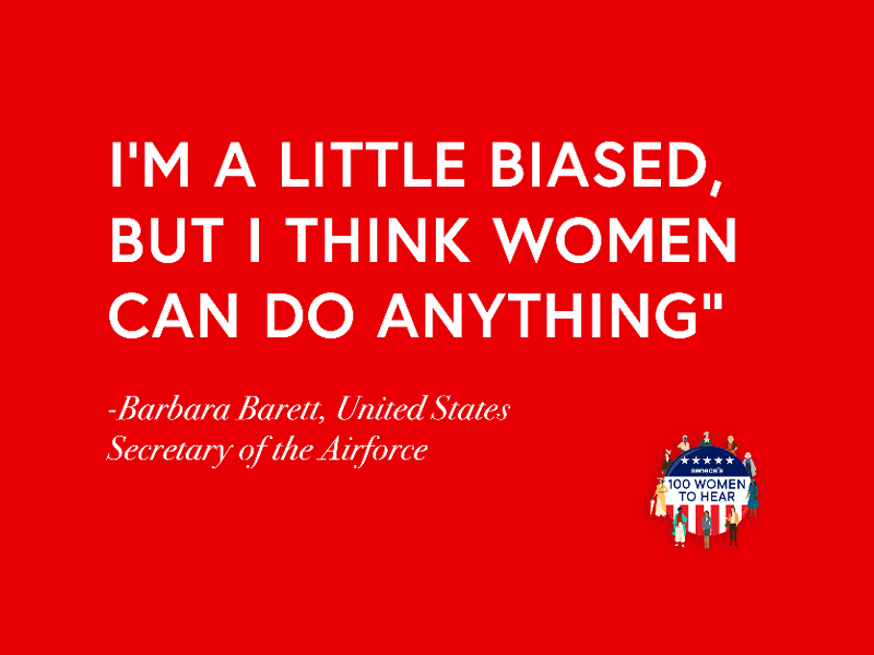
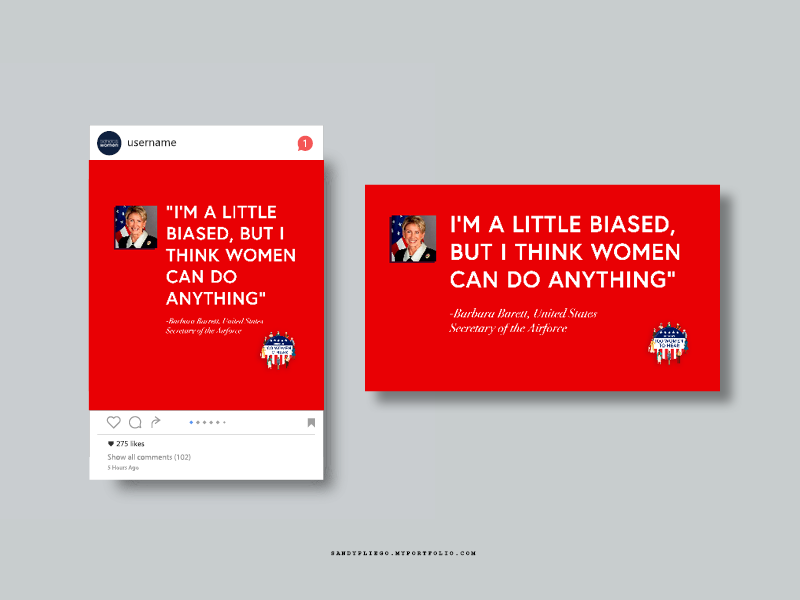
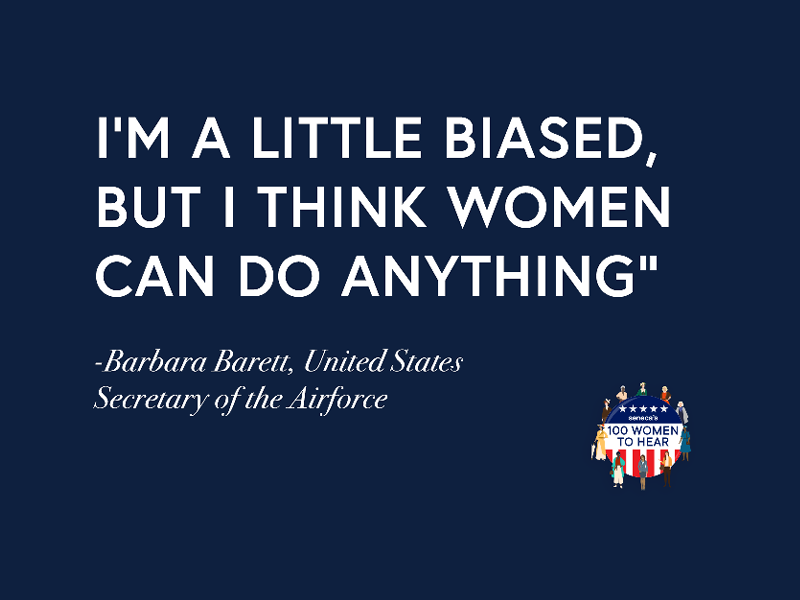
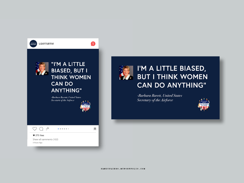
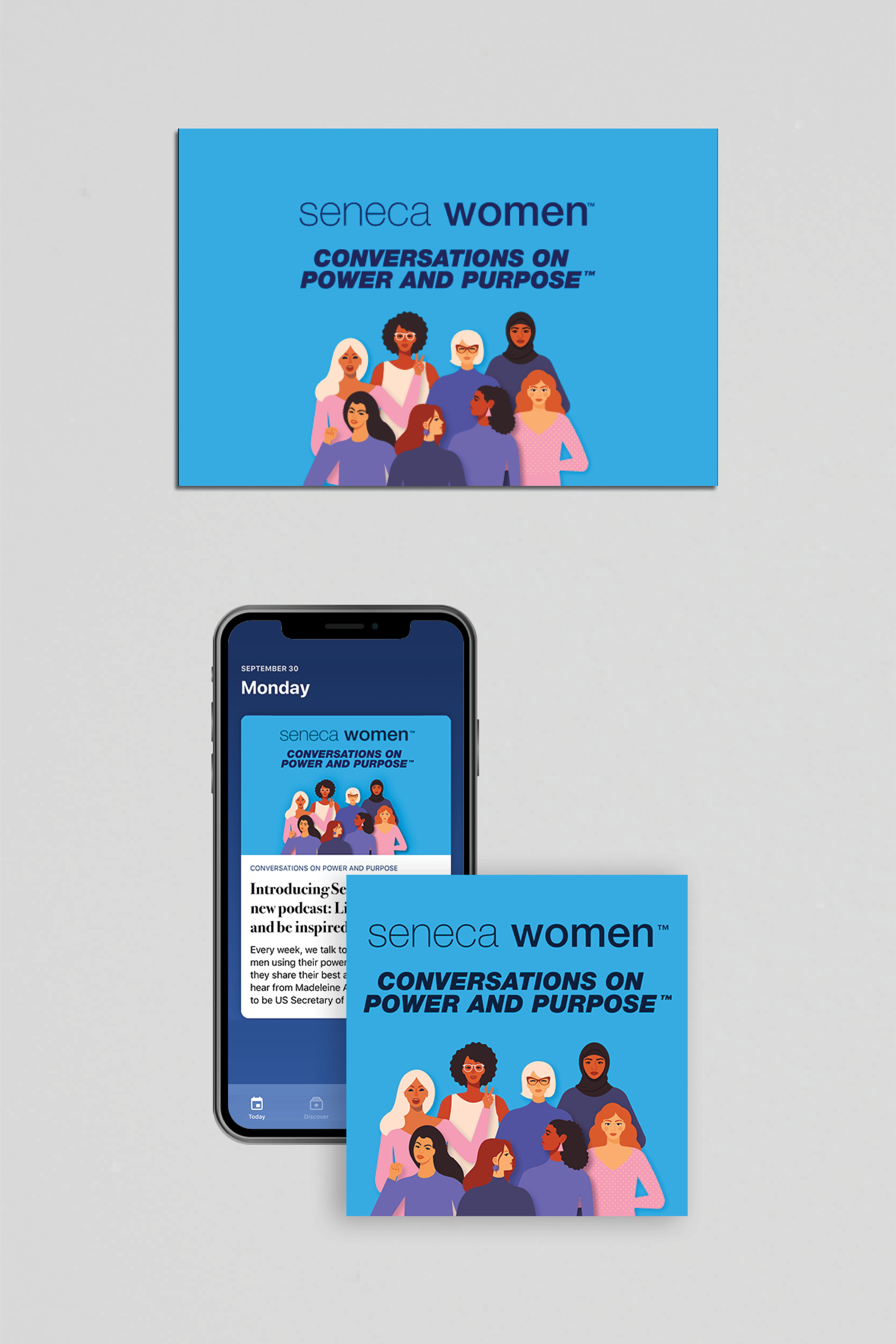
101 Women to Hear: Social Media Post (Graphic Design) (2021)
The Visual Strategy & Execution:
Our approach focused on creating a cohesive visual system that empowered the message.
Our approach focused on creating a cohesive visual system that empowered the message.
Establishing a Brand Aesthetic: Seneca Women's mission demands a sophisticated and impactful visual identity. My strategy would center on a palette that feels empowering, perhaps drawing from deep, resonant tones juxtaposed with bright, optimistic accents to signify strength and progress.
Typographic Voice: For initiatives like "101 Women to Hear," the typographic treatment is paramount. I'd select typefaces that convey authority and clarity, possibly a robust sans-serif for headlines that commands attention, paired with a highly legible, refined serif or sans-serif for body copy. The hierarchy would be to ensure instant readability and a clear understanding of the message, making the names and achievements of these women truly stand out.
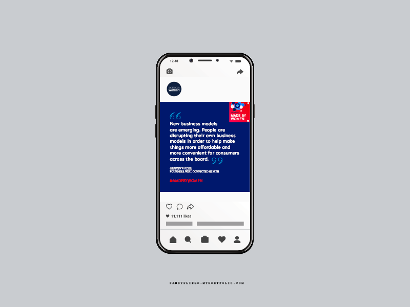
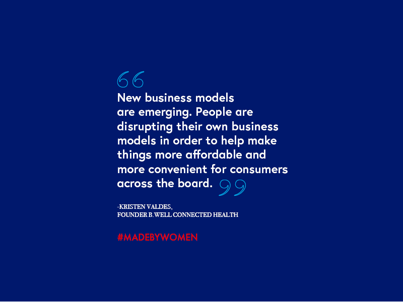
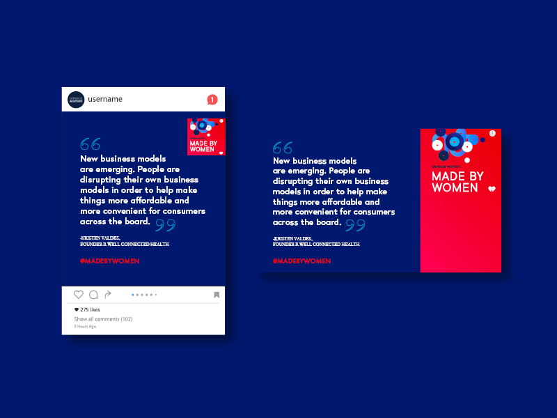
Imagery & Composition (Social Media): Social media posts, by their very nature, require immediate visual punch. For "Made By Women" or similar campaigns, the imagery strategy would lean into authentic photography that showcases diversity, strength, and innovation. The composition would be clean, often featuring strong central figures or compelling visual metaphors. Overlays, graphic elements, or subtle textures would create a distinctive brand presence without overwhelming the primary message or the featured individual. Motion graphics, in particular, offer a dynamic layer to draw the eye and infuse energy into the message, using subtle animation or transitions to highlight key points.
Made By Women: Social Media Post (Graphic Design) (2021)
Seneca Women Podcast (Cover Design x Motion Graphics) (2019)
This indicates a fusion of static and dynamic design elements. The visual hierarchy would be paramount for a cover: how do we visually summarize the content and entice the viewer? This involves bold typography, impactful hero imagery or abstract visuals, and a clear, concise layout. The addition of motion graphics elevates this to an even more engaging experience – subtle movements could reveal layers of information, highlight key names, or add a sophisticated fluidity that captures and holds attention, making the brand feel cutting-edge and vibrant.

The Outcome & Visual Impact:
The visual design for Seneca Women, through its considered approach to graphic design and motion, effectively amplifies their powerful message. By focusing on a strong, contemporary aesthetic, clear typographic hierarchy, and impactful visual storytelling, the assets work in concert to create a memorable and empowering brand presence in the digital space. The goal is to ensure that every visual piece communicates information and reinforces the gravitas and inspiration inherent in celebrating women's achievements.
The visual design for Seneca Women, through its considered approach to graphic design and motion, effectively amplifies their powerful message. By focusing on a strong, contemporary aesthetic, clear typographic hierarchy, and impactful visual storytelling, the assets work in concert to create a memorable and empowering brand presence in the digital space. The goal is to ensure that every visual piece communicates information and reinforces the gravitas and inspiration inherent in celebrating women's achievements.